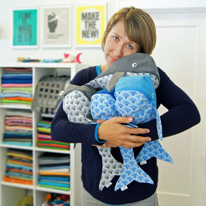
 If you're curious, yes I still have MinneBites! But I'm slowly moving away from that product line, which I did almost exclusively for about 8 years. Although I may decide to continue making and selling MinneBites in the future, for now I've decided to concentrate on fine art, both painting and textiles. In fact, I'm getting ready for something new on that end right now - selling at outdoor festivals! THANK YOU!
You can find MinneBites: handmade bags with bite in my Etsy shop, I still have quite a bit in stock, but you may want to shop now for the best selection. XOXO 
0 Comments
Getting Ready
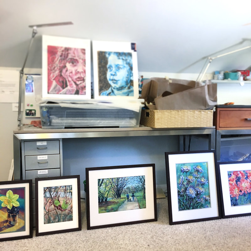
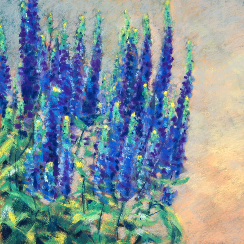
Step three - and very importantly! - I've got to purchase a tent. It'll happen soon. I'm doing research. Edina Fall Into the ArtsAnd so! This September, I'll be at the Edina Fall Into the Arts Festival. This will be my first ever outdoor art fair! I'll have a tent full of my new work in pastels, both originals and prints, along with a nice selection of my textile art work. I'm very excited. I'm hoping for nice weather and a great crowd! Examples of the work I'll have at the festival
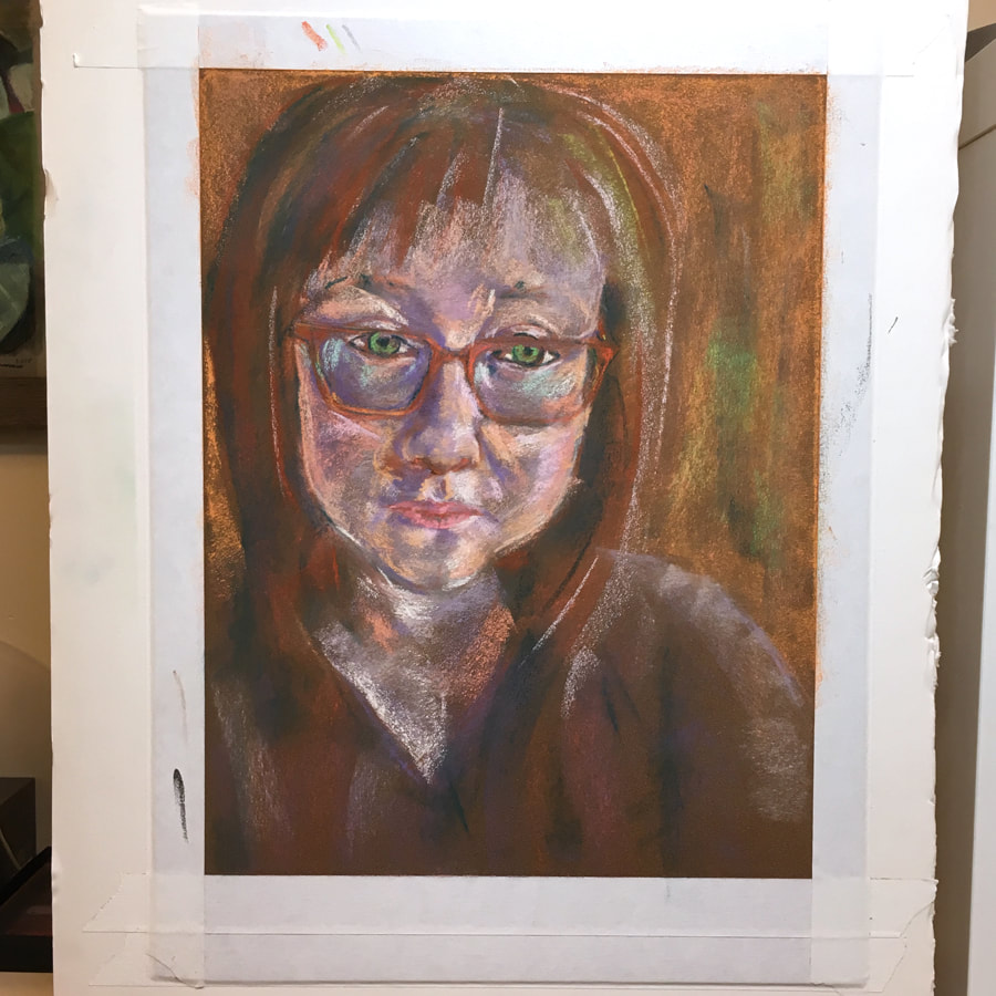
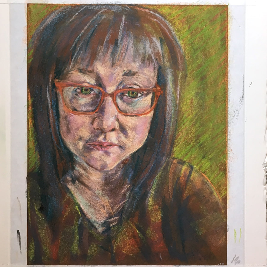
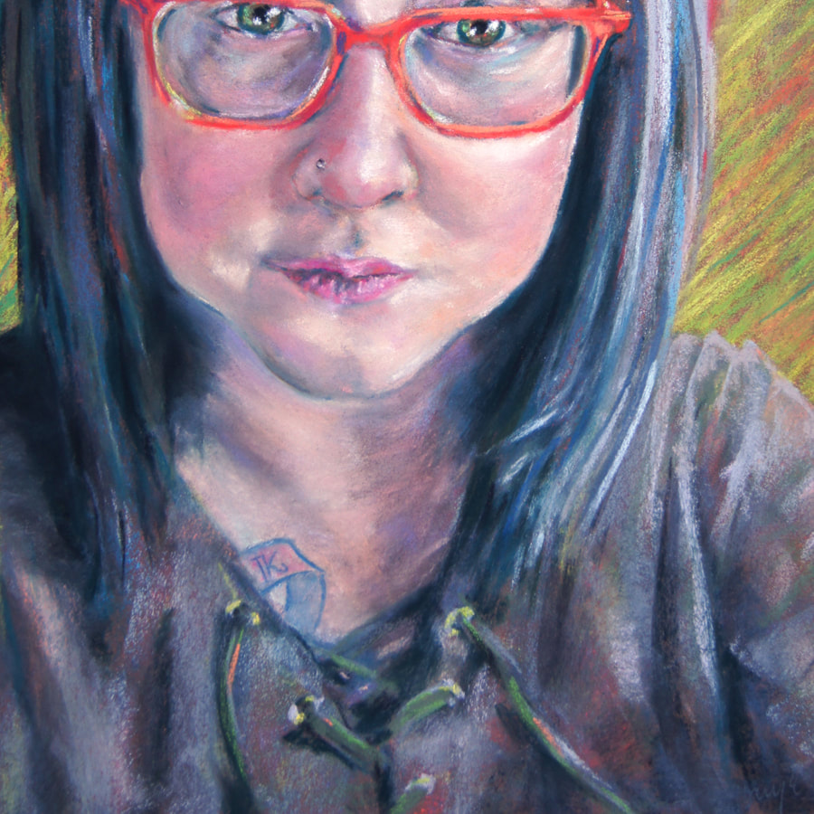
I hope to see you at the Edina Fall into the Arts Festival this September! Find more of my upcoming events here.  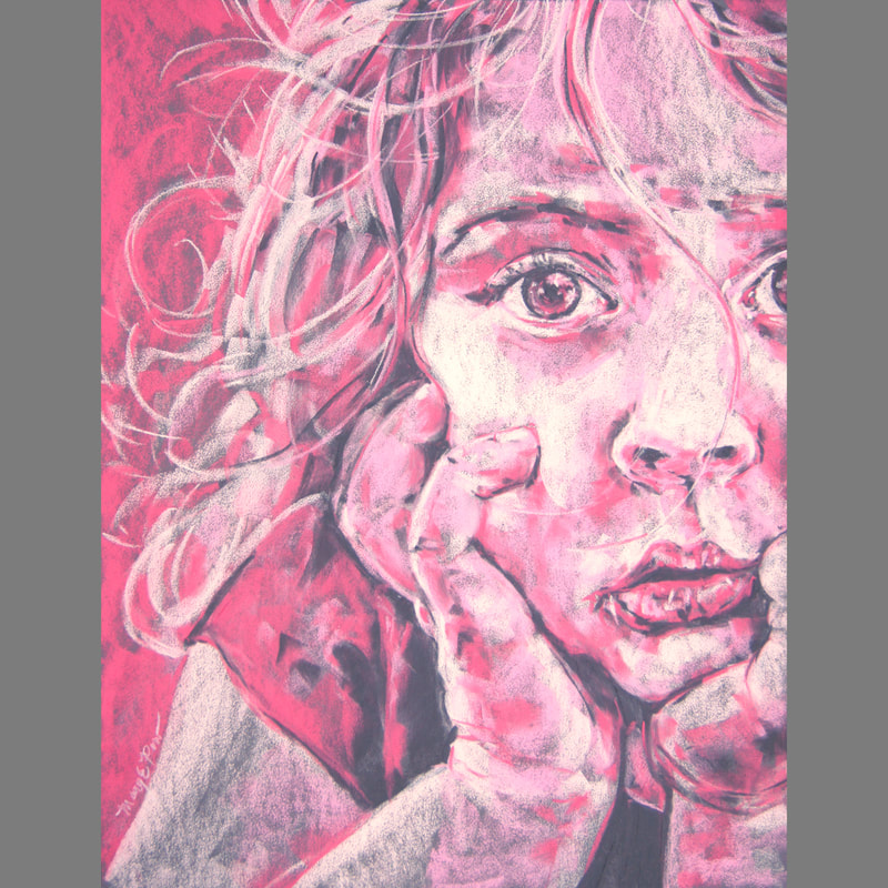 Work in progress. Reference is a photograph taken by Tanya Ketchum. I find that I'm drawn more and more to painting people. I've been inspired by a number of photographs taken by friends and family and have used their photos, with permission, to create artworks. However, I believe it's time for me find willing subjects (my own kids really don't like getting their photos taken!) so I can have a variety of my own photo references to work from. I'm looking for models! Being a model is fun and easy. Here are some things to know.
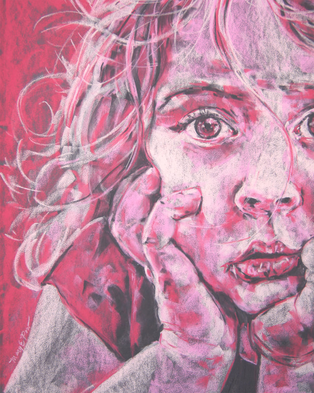
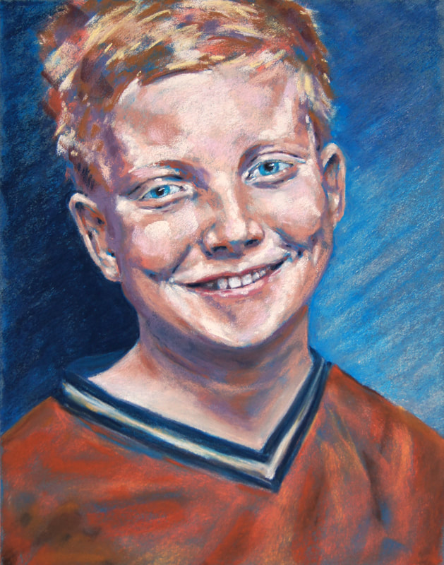
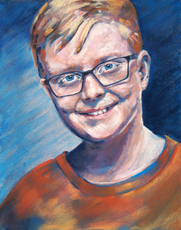
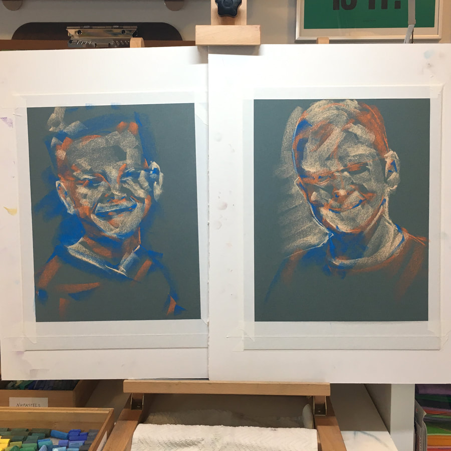
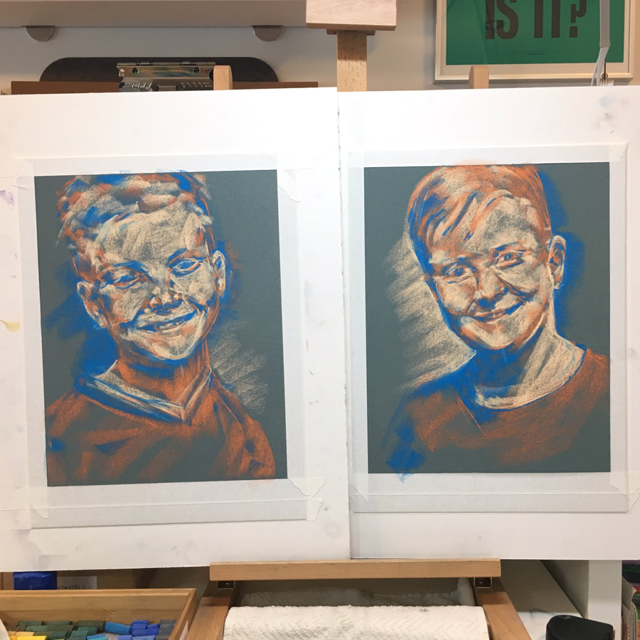
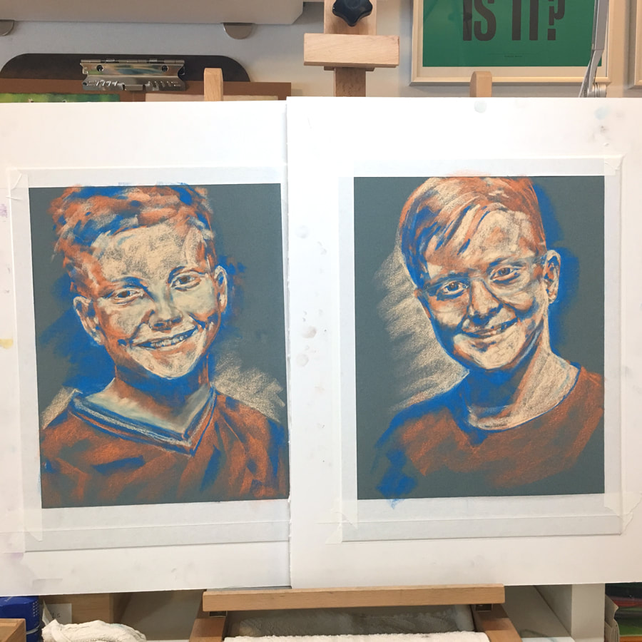
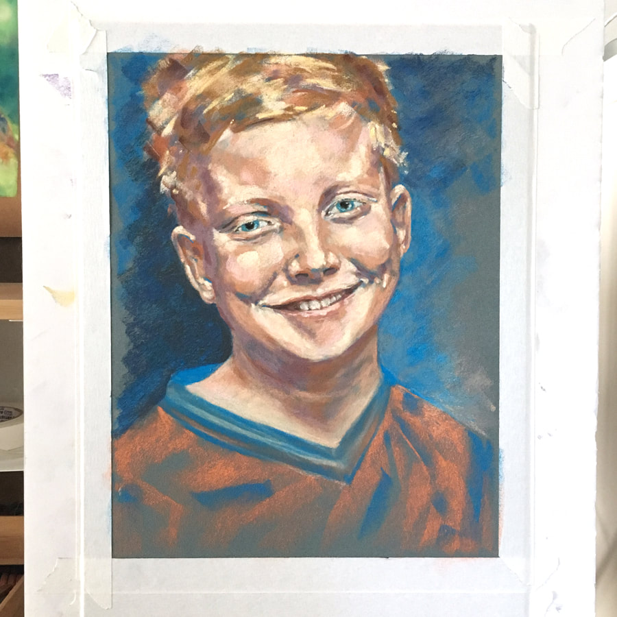
If you, your kids, or someone you know is interested in being subjects for my art, please contact me via email at mary@marypow.com.  I put the final touches on Jonah's portrait today. So, now my Portrait Project "Addendum" has wrapped up and my Portrait Project is officially finished! Twins Noah and Jonah are a coordinated set of paintings, meant to be framed separately, but displayed together. I focused on capturing their two different personalities, while also having the pair of paintings still match. They are twins, after all! I kept my mark-making loose and free with this pair. Preteen boys are endlessly growing and changing, and always active. I feel that this loose look showcases the idea that these paintings capture but a moment in time.
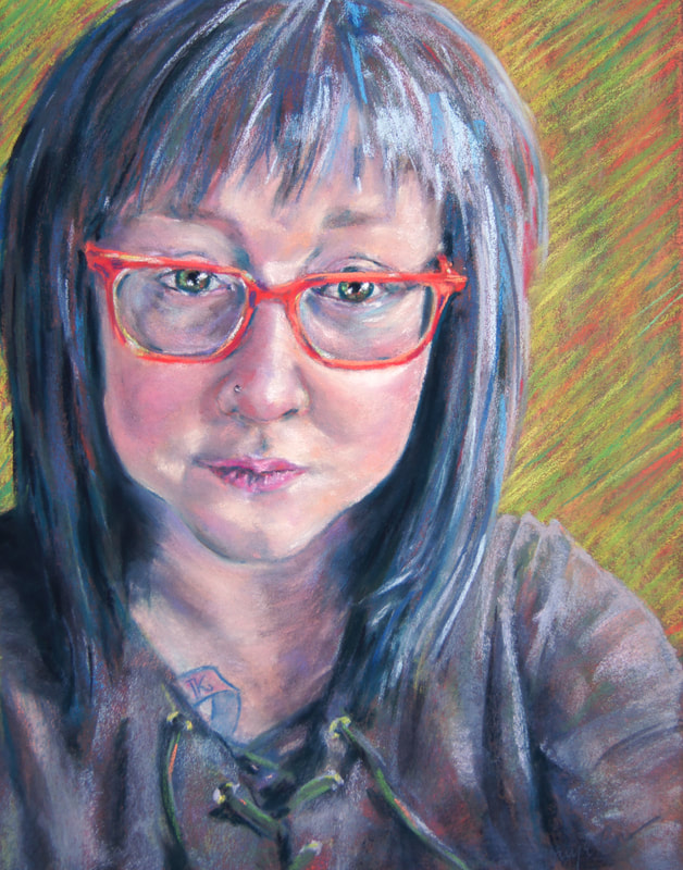
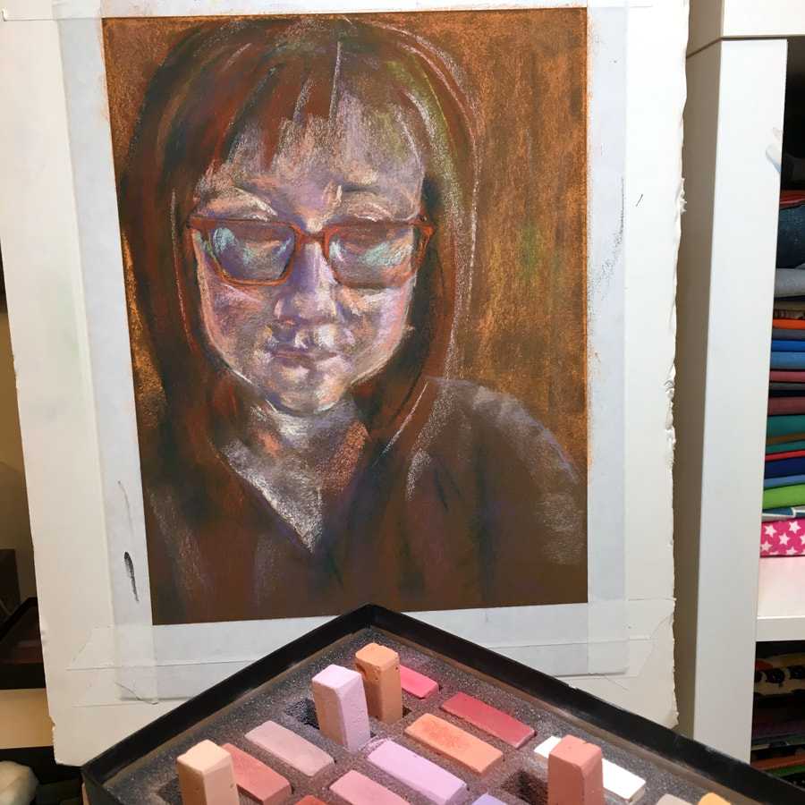
Thanks to all of my Portrait Project "Addendum" subjects! The Portrait Project may be over, but I will continue with portraits. Contact me if you're interested in having a custom portrait painted. If you'd like to take a look at all of the portraits together, see them in my portfolio.  I'm back at work on my Portrait Project, working on the twin boys! It's going really well and I'm having a wonderful time with them. I'm sure I've said it before, but I have to say it again - I never would have guessed that painting portraits would be something that I'd enjoy this much. But it's true; I love it! I also finished another portrait in April! So, here's Addendum, Part 1 to my Portrait Project showing my in progress work on these final three. Melanie
Noah & Jonah
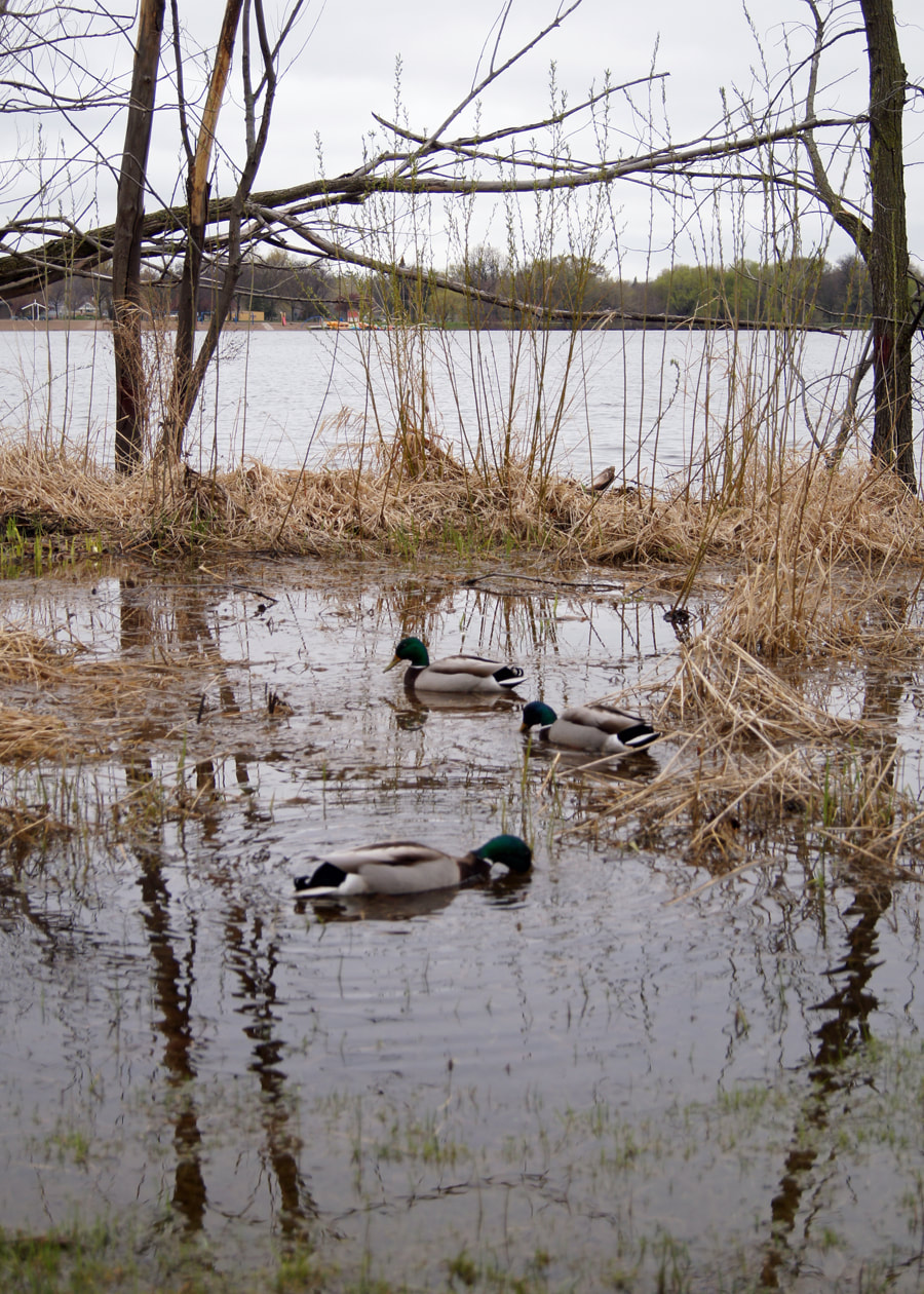
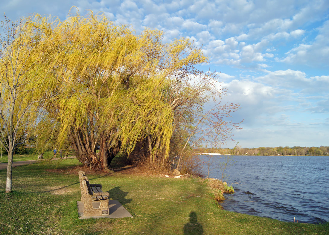
I should have an Addendum, Part 2 with the finished portraits in about a week! If you want to find out more about having a portrait commissioned, please contact me or view my commission request page. I'm always happy to chat!  I made it halfway through my goal of 10 pastel paintings of my neighborhood lake before Spring hit me full on - and I took to my garden. :) 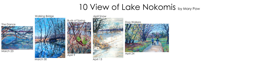 Five finished pastel paintings of Lake Nokomis. March 23 - April 24. All winter I've been planning a huge DIY landscaping project to overhaul my backyard and it was time to start! I love to design, I love to grow things, I love to be outside, and my kids are now old enough to handle themselves for long periods of time, so not much could stop me from getting to it. And after I finished my work for my art exhibition "Orient, Disorient Repeat" - I couldn't focus on anything else but my garden! Now I've finished most of the planned landscaping and the summer heat has set in, so I'll be back to this pastel project soon. I have three more photographs of the lake in my queue, which will bring my total to eight. Two images short!
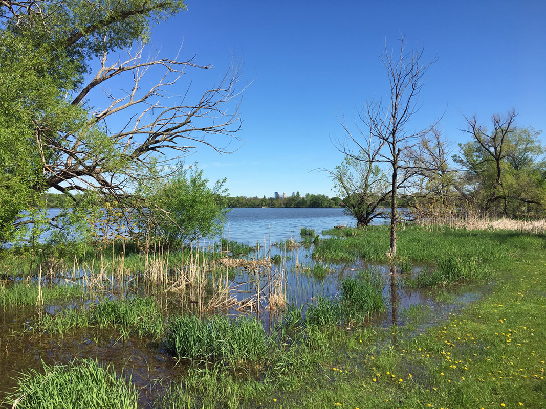
These are the next three photos of the lake I plan to paint. I had wanted to include a sunrise and a sunset image, but now if I do there will be a big gap between the dates. I haven't even been on a walk around the lake since May 20th due to my yard work giving me plenty of exercise! Oh well, I may just take some photos for those two a bit later than planned. Then I will have my 10 view of Lake Nokomis. Stay tuned!  In one episode of the podcast Hidden Brain, host Shankar Vedantam describes a theory called the edge effect, which is the point where two ecosystems adjoin. It's at this location that the most new life forms are created. Shankar then asks the question: "What could happen when strangers meet?" He explains that interesting things can happen when people from different cultures, backgrounds, and points of view, work together. Just like the edge effect between ecosystems, innovation is more likely to occur when diverse ideas come together. Diversity and creativity go hand in hand.
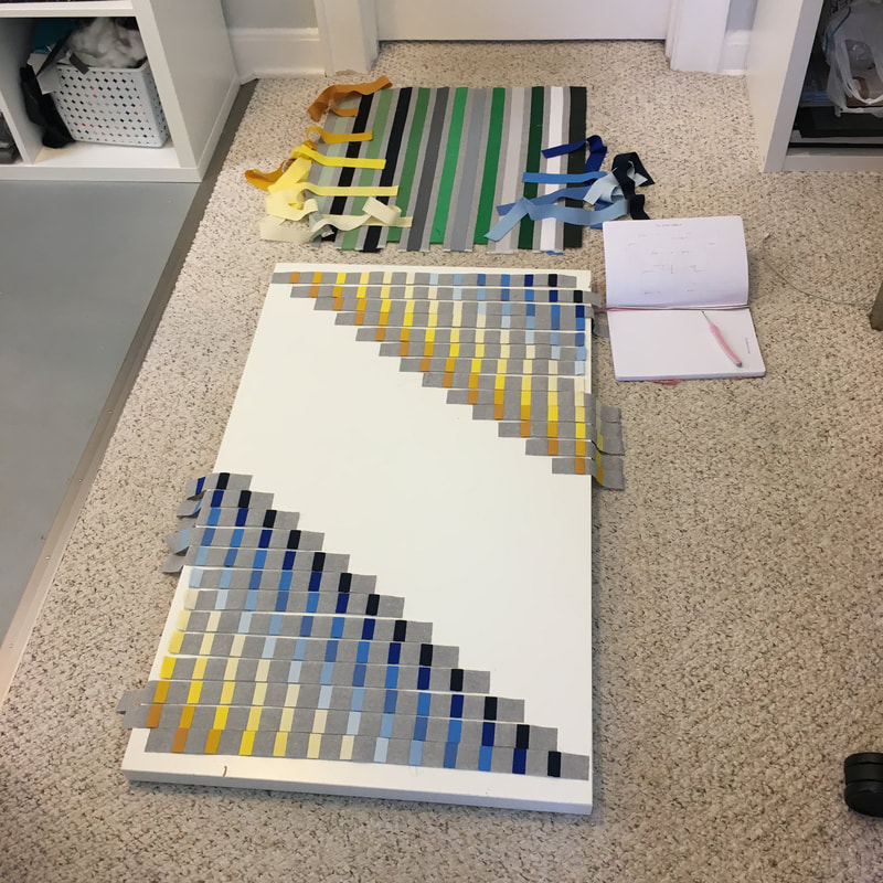
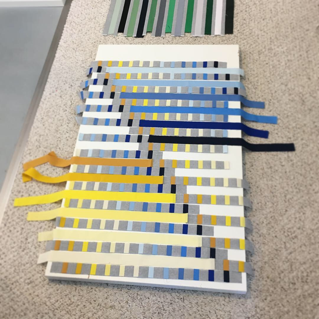
Photos of "The Edge Effect" in progress. I've found that I can use the concept of the edge effect on an individual level to spark creativity in my art practice and my life. Simply by doing something different, trying something new, listening to another point of view, or putting uncertainty into my day, can cause a spark of creativity. Trusting that spark and seeing where it takes me is a challenging, but satisfying thing to try. In the past year, I've used these concepts to break things and start anew. It is scary and uncomfortable to step into the unknown. But it's also exciting. And it's amazingly gratifying to come out the other side and see how you've grown! 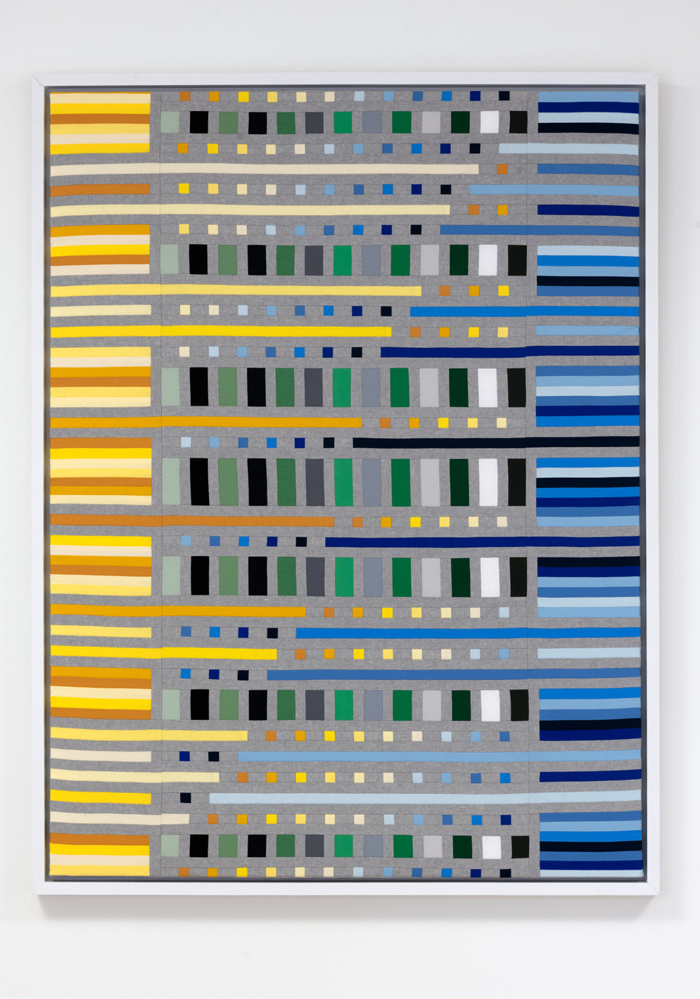 "The Edge Effect" • cotton and linen fabrics, thread, framed • 50"H x 38"W Everyone has a desire to be comfortable and safe, but the most interesting things can happen when you allow yourself to be uncomfortable. Open your mind to possibility. Be curious.  Opening Reception for the Exhibition 'Orient, Disorient, Repeat' |
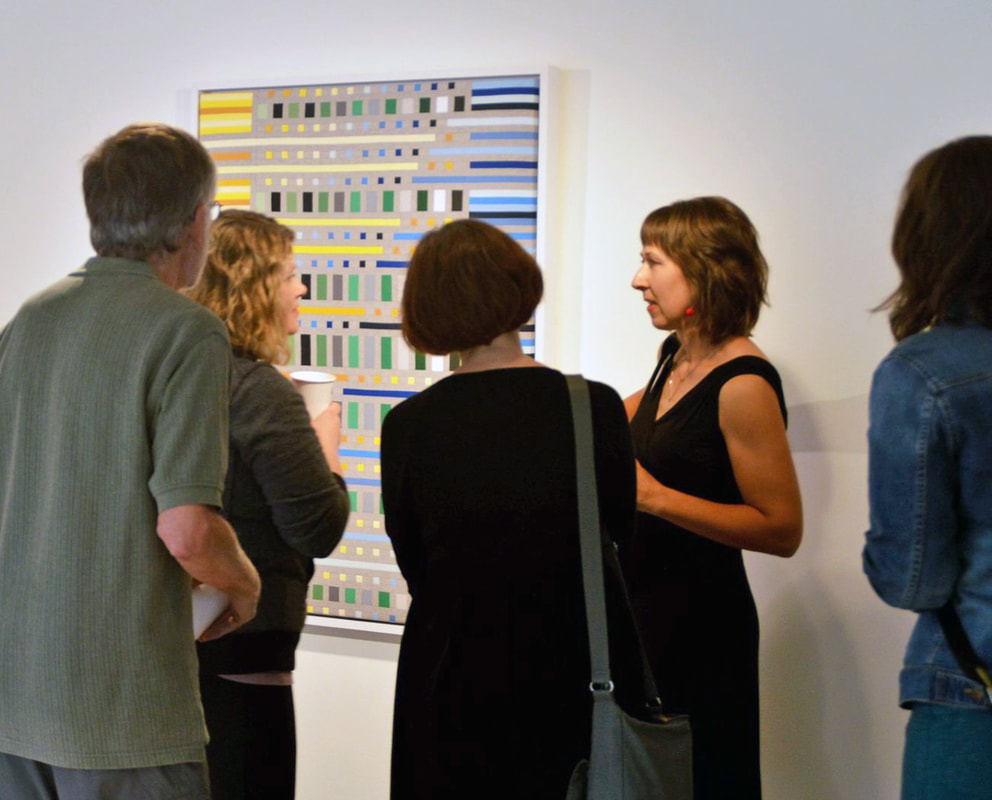
Images of My Work at the Exhibition | Photography by Rik Sfarra |
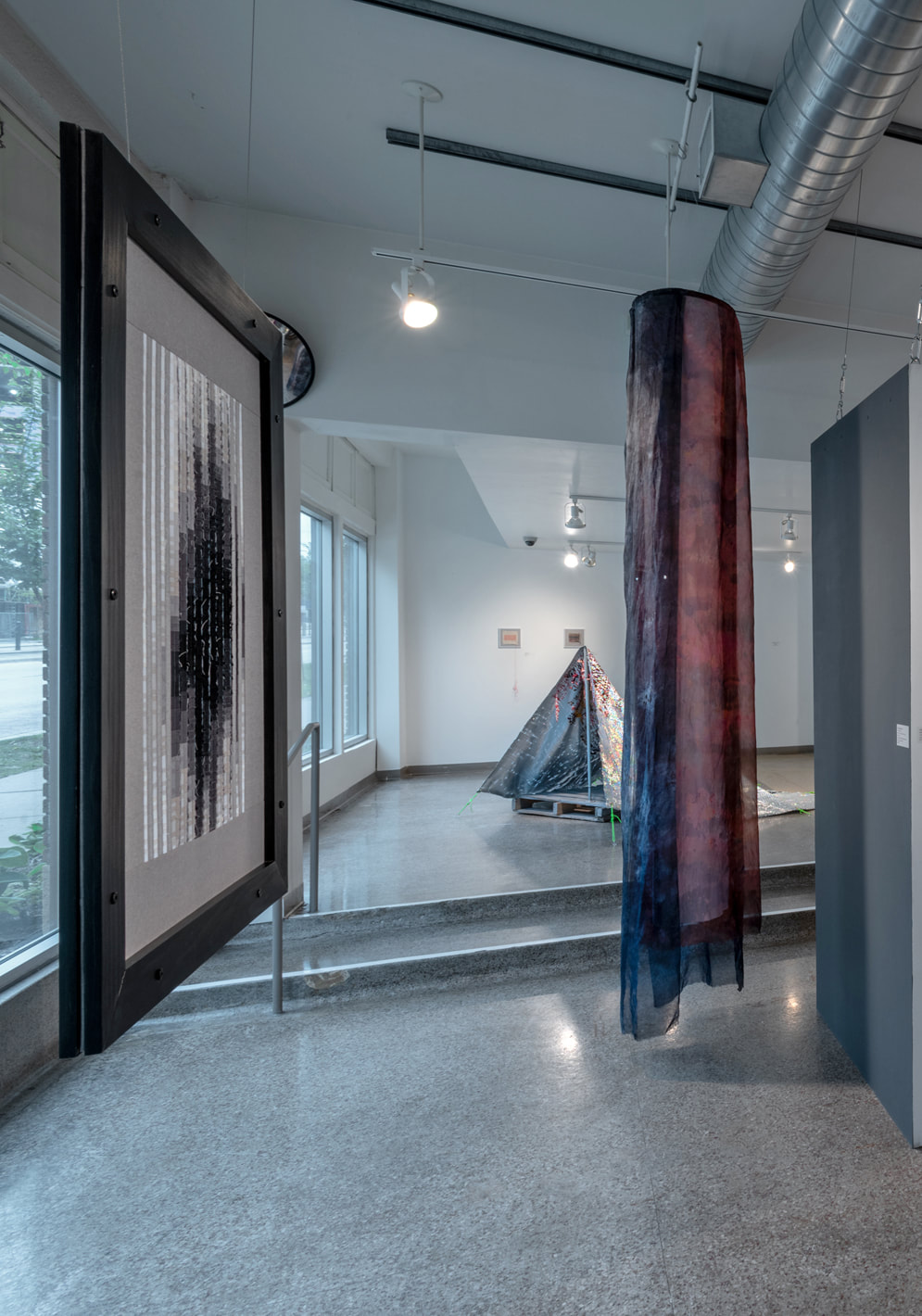 "The Way Out is Through" on left | 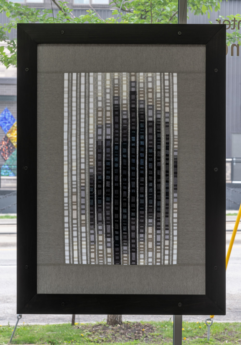 "The Way Out is Through" |  "The Edge Effect" |
Thank you to everyone for coming to the opening reception! If you missed it, you can see the exhibition through July 27, 2019.

Yesterday I wrote down a sentence I heard Joshua Johnson say on the radio: "How you see the world depends on where you look." It's a timely quote for me.
Personally, I think we probably need them all. Who is to choose which ones we don't need? Everyone has a different viewpoint. Everyone has a different opinion.
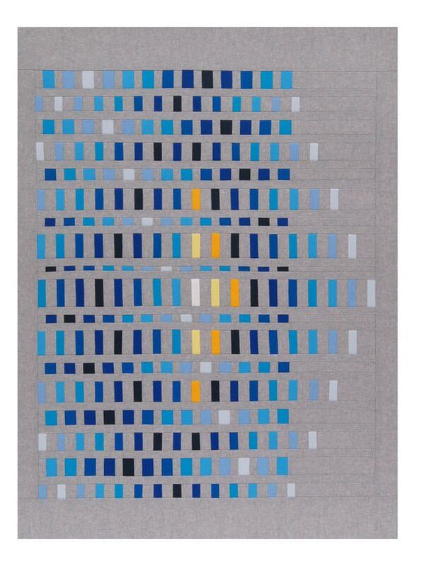
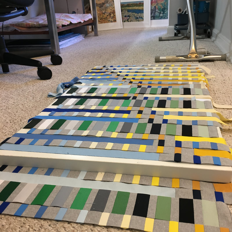
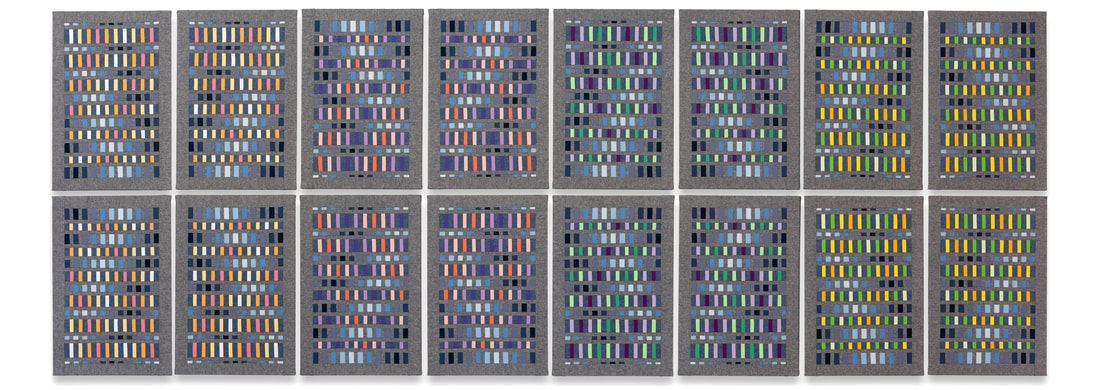
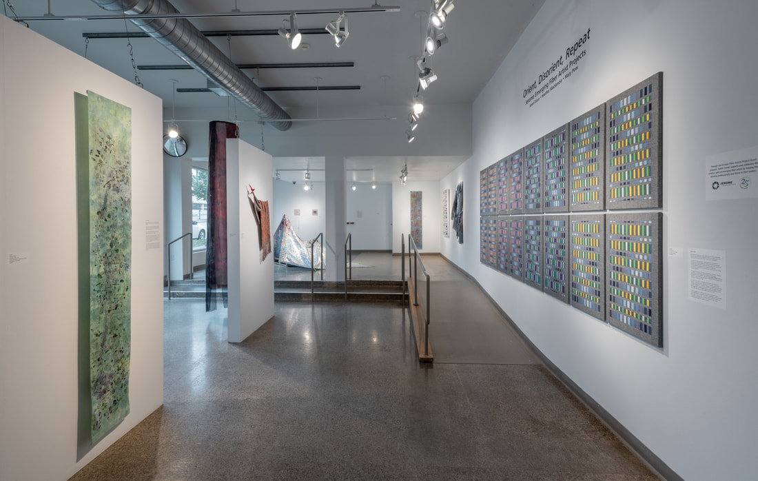
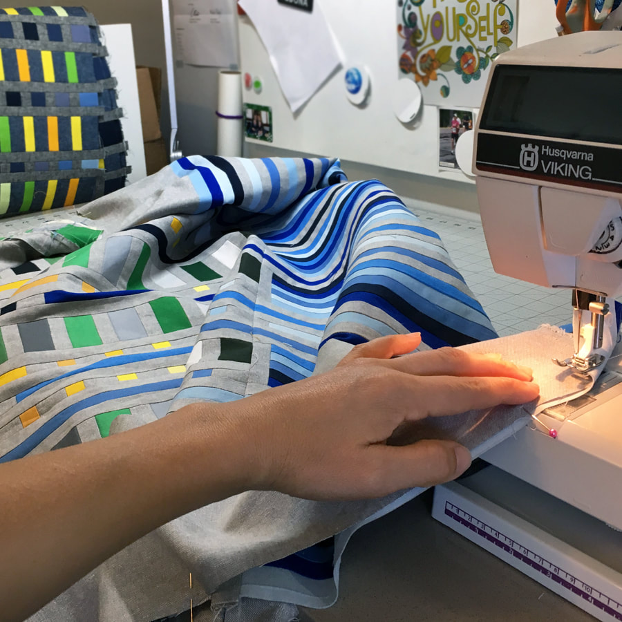
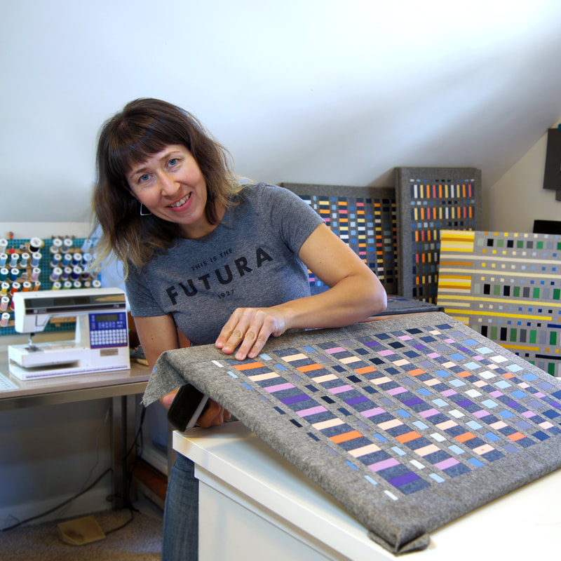
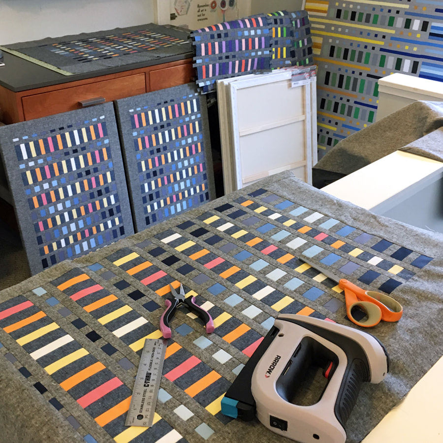 My artwork entitled "Luster" is composed of 16 panels. It will be approximately 14 feet long by 5 feet high when installed in the gallery. | 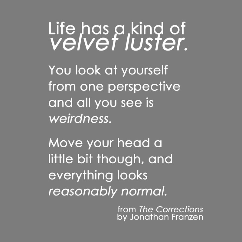 Title inspiration for my piece, "Luster". |
I hope to see you there! I'll be more than interested in hearing your viewpoint.

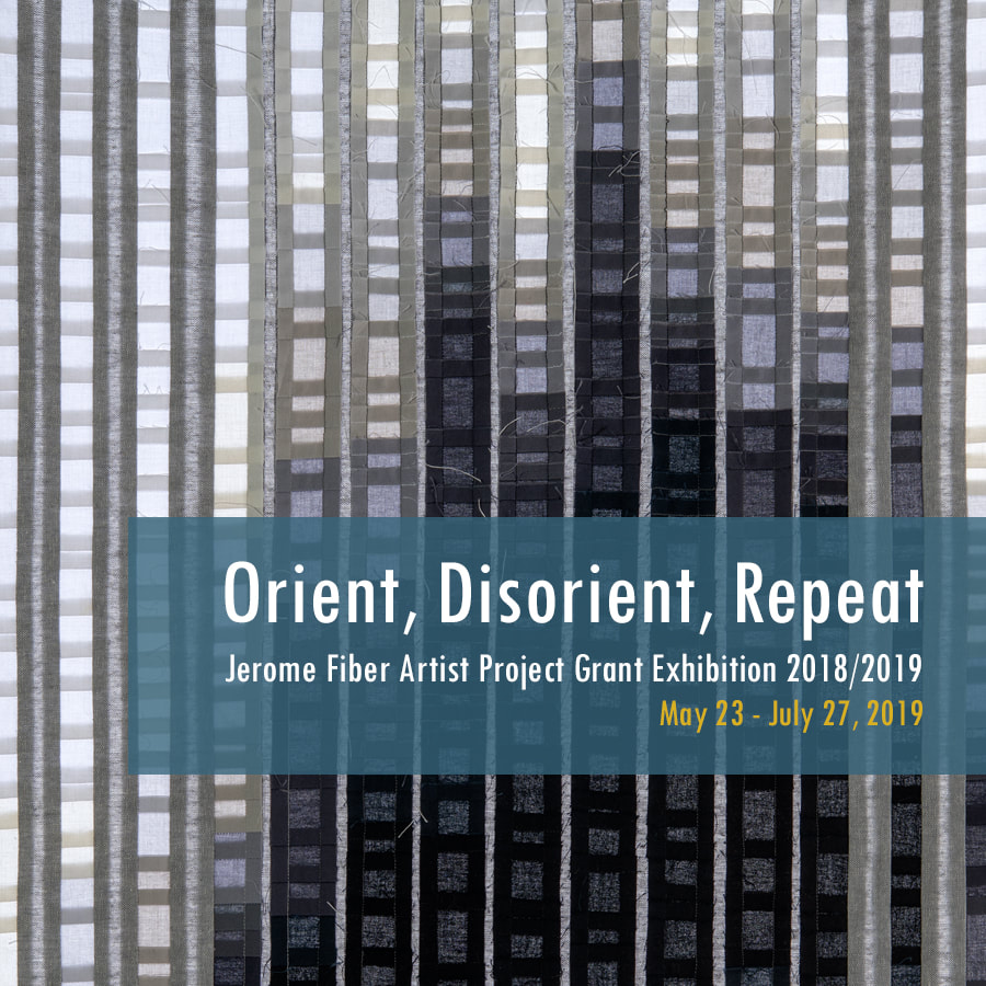
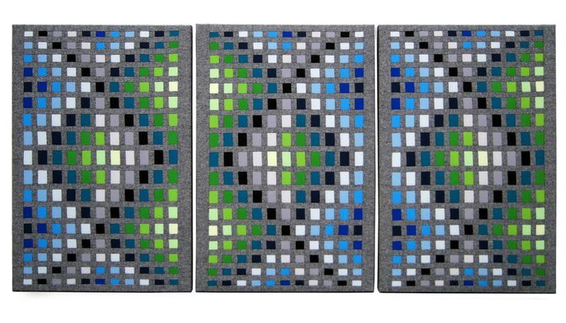
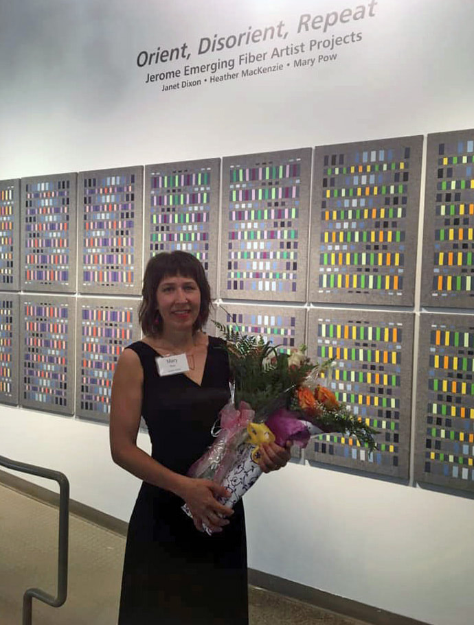
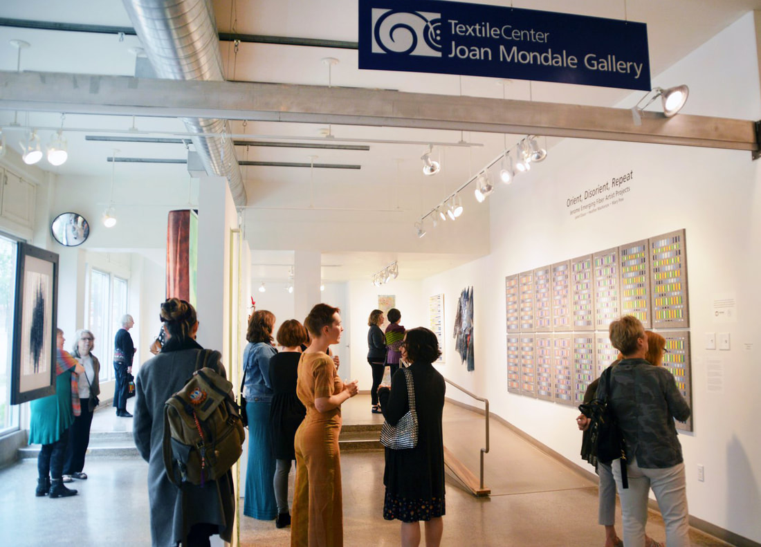
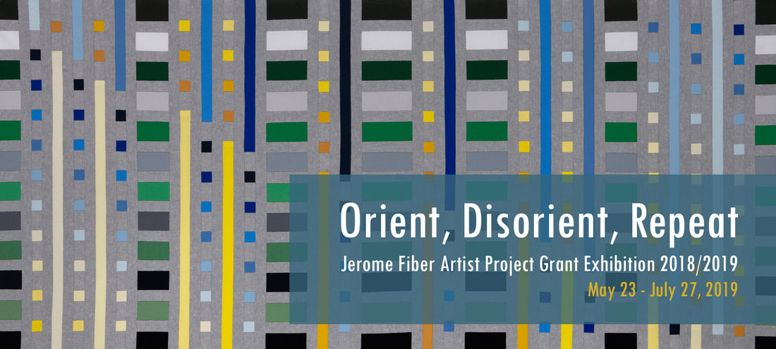
Well, the year is coming to a close and I'm so proud that my resulting textile artworks will be on display for 9 weeks at Textile Center's Joan Mondale Gallery starting on May 23rd.
I do hope you'll join me for the opening day!
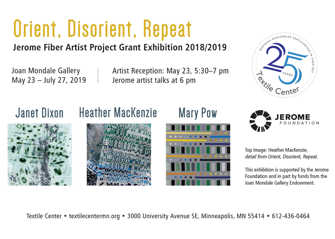
Janet Dixon uses memory and imagination as a basis for the autobiographical abstract maps she creates using breakdown screen-printing and low immersion dyeing.
In her Queer Encrypted Weavings, Heather MacKenzie is creating an ongoing series of queer heirlooms using contributed text coded into textile structures.

Mary Pow
I am an artist and designer based in Minneapolis, Minnesota. My specialties are textiles and pastels.
I also enjoy reflecting on the human condition.
In my blog, I write about my musings and my art.
Find my bio here.
Categories
All
American Craft Show
Art & Craft Shows
Creativity
Exhibitions
In The Shop
Jerome Project Grant
Mary Pow Handbags
MinneBites
Motherhood
Musings
Pastel Painting
Poetry & Writing
Portrait Project
Process
Quarantine Project
Textile Art
The Art Business
Archives
February 2024
November 2023
March 2023
February 2023
April 2022
April 2021
September 2020
August 2020
July 2020
April 2020
February 2020
December 2019
September 2019
August 2019
July 2019
June 2019
May 2019
April 2019
March 2019
February 2019
January 2019
December 2018
November 2018
August 2018
March 2018
January 2018
April 2017
March 2017
October 2016
June 2016
May 2016
April 2016
March 2016
February 2016
January 2016
 RSS Feed